What’s important to know when featuring a building or other structure in a painting?
5 accomplished contemporary watercolorists share some tried-and-tested advice.
Iain Stewart
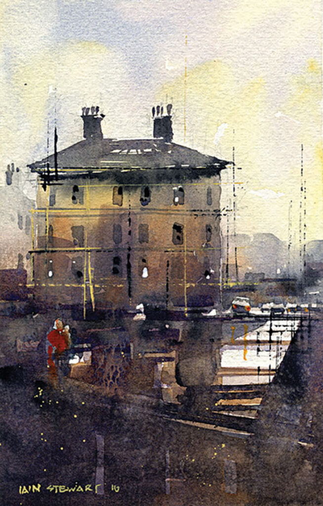
“Try to see the big shapes first and define them. Getting caught up in counting windows or spacing corbels is about as boring as reading this sentence. So, my first question is always: How can I simplify this? My second is: What do I need to add to make it read the way I want it to? Typically, quick marks and confident brushstrokes win out. One last thing: A building can be defined using only light and shadow. Remember that one.” —Iain Stewart
John Salminen
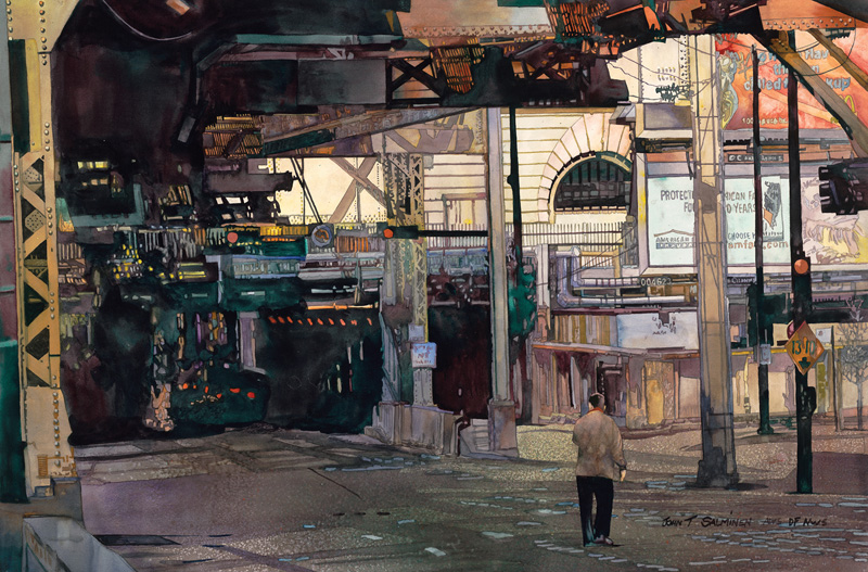
“I approach my urban landscapes as abstractions, designing the scene with composition as my foremost consideration. The shapes I use, given the nature of architecture, tend to be geometric. This provides a perfect opportunity to add a figure as a center of interest, adding both scale and contrast. The organic human form can both complement and reinforce the bold monumentality of an urban scene.” —John Salminen
Thomas W Schaller
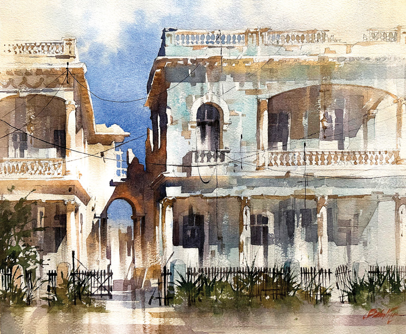
“A building isn’t just a solid object; it’s a container of spaces—spaces filled with memories, dreams and stories. So, when you’re painting elements of a built environment, remember that architecture is only as memorable as the people who live, work or interact with it. Whether in the city or countryside, including some context—a bit of urban energy or the rural calm— helps provide a narrative that will enliven your work.” —Thomas W Schaller
Brenda Swenson
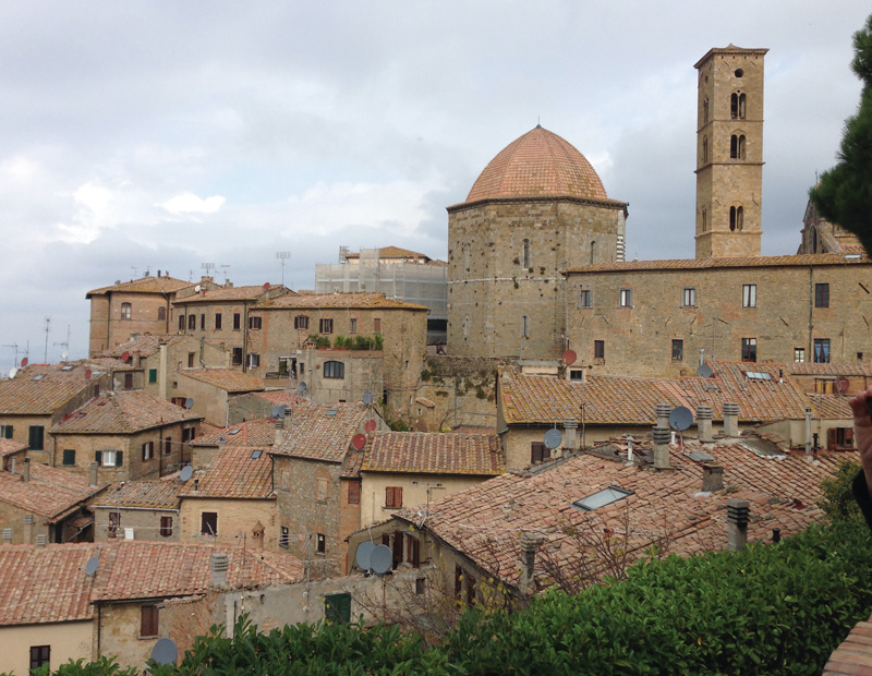
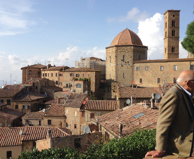
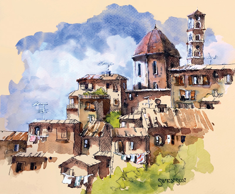
In the first photo of the mountaintop town in Tuscany (left), the light is flat and the scene lacks depth. The second photo (right), which Brenda Swenson used for her sketch, Volterra (watercolor and ink on toned paper, 8×10), features strong, directional light that, she says, “reveals form, color, texture and life.”
“Let light do the heavy lifting. Light reveals form, color and texture. I’ve always been drawn to strong light. It’s usually the reason I choose to paint a scene in the first place. When sketching or painting architecture, I look for strong directional light (not mid-day). I utilize cast and form shadows to link buildings together. Too many small shadows will look busy, like a checkerboard, so I often “grow” the shadows (making them longer or larger) to link multiple buildings together and unify the scene.” —Brenda Swenson
Peter Jablokow
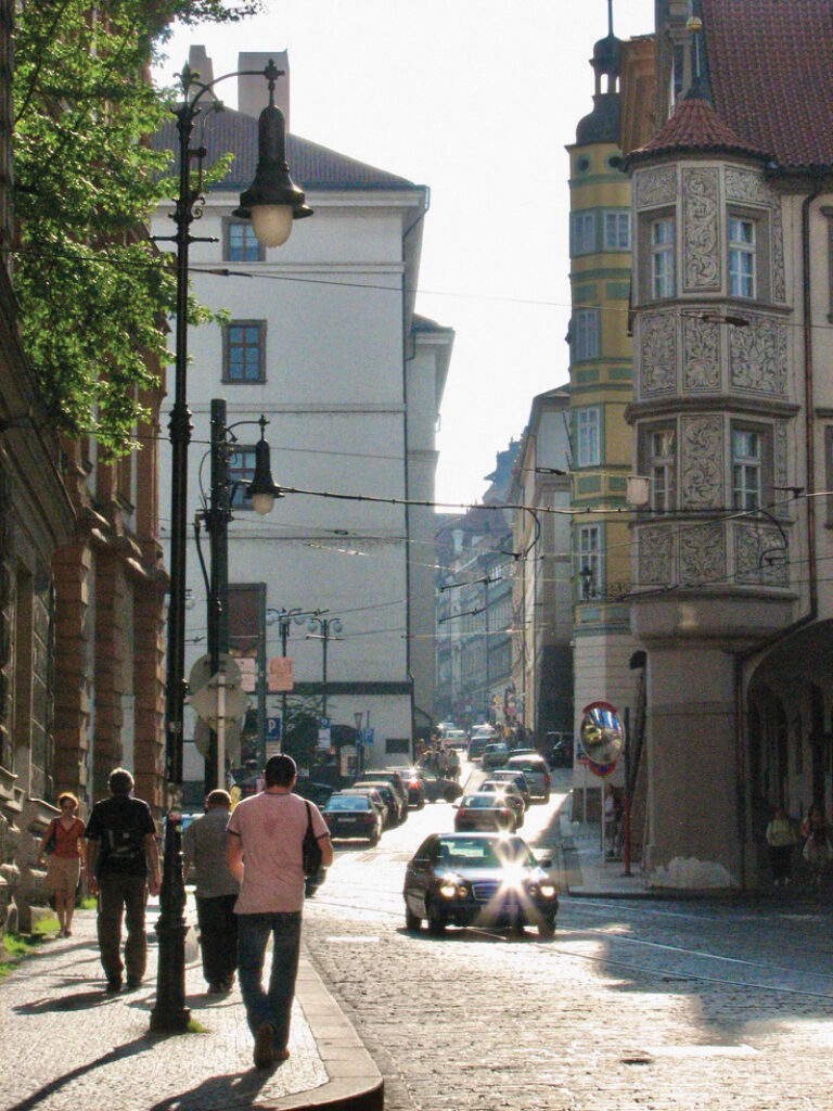
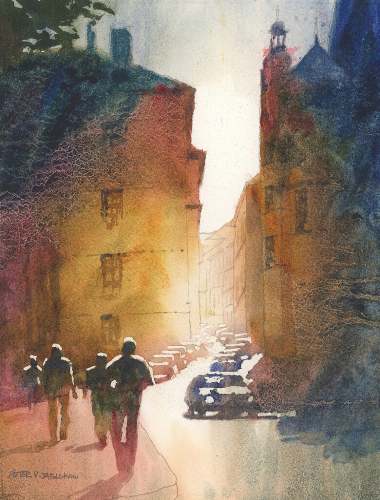
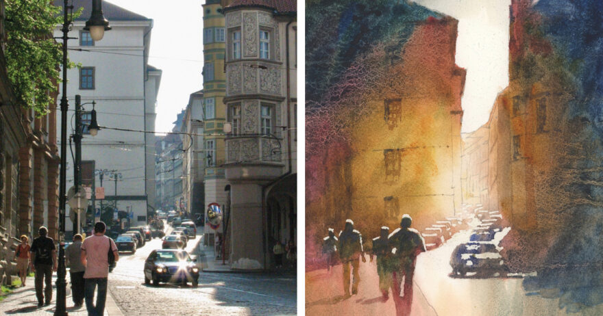
The photo that Peter Jablokow used as reference for his watercolor (left) includes an abundance of detail, much of which he left out to create a stronger creative statement.
“Architecture has so many clean, sharp edges and contrasting shapes that I tend to look at all of them, one by one, quickly becoming overwhelmed. I know I can focus on only one spot, so my solution is to detail one area and suggest or discard the rest. Sometimes, a basic lighting pattern or overall shape can be all that’s needed. In a landscape, the overall value pattern with a couple of hard edges is often enough, or even a hard-edged shape with no other detail at all. In an urban scene, the overall pattern or rhythm overrides details except in areas of interest. I push myself to eliminate as much as possible, and the result tends to be more pleasing and less cluttered. In the watercolor below, the cityscape is a backdrop for the people and cars, so the overall pattern of building shapes is all that I needed to set the stage.” —Peter Jablokow
From Our Shop














pastel on grey paper